Skeuomorphism, Neumorpshism and Flat Design
Skeuomorphism is the art of designing an artifact as an imitation of its real-life original version. The classic examples of skeuomorphism are digital calculators, calendars, and folders in apps which seek to exactly imitate the look, operation, and function of their real-life physical counterparts. Skeuomorphism played a critical role in the early adoption stage of technology because it offered an explicit visual comprehensibility that increased usability and accelerated the diffusion of technology. However, after reaching a critical mass in adoption, skeuomorphism was no longer needed or wanted - it became a bit of a distraction.
Flat Design brought some refreshing lightness, clarity, and simplicity, which increased usability and accelerated further adoption and diffusion of technology. Flat Design also offered a faster load time and a quicker design, development, and testing time. It became a sustainable trend that lasted for more than a decade. On the other hand, Flat Design is, well, “flat” – it lacks depth, creativity, uniqueness, and standard guidelines. Among all the different design style, Flat Design has been the most used and abused. The basic tenant of Flat Design is simplicity, but simple and minimal turned out to be very hard to achieve. It takes a lot of hard work and talent to create a simple and minimalistic flat design most of which are rather simplistic (not simple), mundane (not minimalistic), common (not unique), and boring (not creative). Thus, Flat Design eventually fell victim of Peter Principle.
Neumorphism stemmed out of skeuomorphism and Flat Design. Unlike skeuomorphism, neumorphism does not attempt to imitate anything. In fact, the focus is not actually on objects themselves but rather on the color palette of the entire interface in which objects reside. In essence, it is about color contrast. Among all design styles including Material Design and Fluent Design, neumorphism has been the most misunderstood and problematic, especially for accessibility by impaired users.
Examples of Bad Neumorphism
On one extreme, there are designers who are stuck in the past and who think that Craigslist represents a great design, and on the other extreme, there are designers who think that apps or websites exist in order to show off their creativity with total disregard to usability. Sadly, no company is immune from such extremes - small and large companies alike can easily fall in one extreme or the other. In a way, while Flat Design translated into “not trying hard enough”, neumorphism translated into “trying too hard” to impress or be different such as the examples shown below.
Glassmorphism
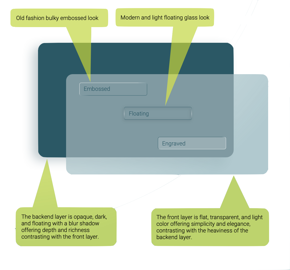
Glassmorphism is a hybrid design that takes the best of all other design styles – it is simple yet rich, flat yet dimensional, and neumorphic yet visible, usable, and accessible. Glassmorphism offers a transparency effect and often with a glass look combined with gradient, blurred shadow, and a floating perception instead of the old fashion embossed look. Thus, the user interface looks multi-layered with some vivid colors contrasting with subtle light colors on translucent objects. Those special effects give the illusion of depth, yet certain elements are flat giving the perception of closeness. It is exactly these contrasts between flat and floating, rich and simple, vivid and light colors that makes the user interface so appealing.
Glassmorphism & Neumorphism
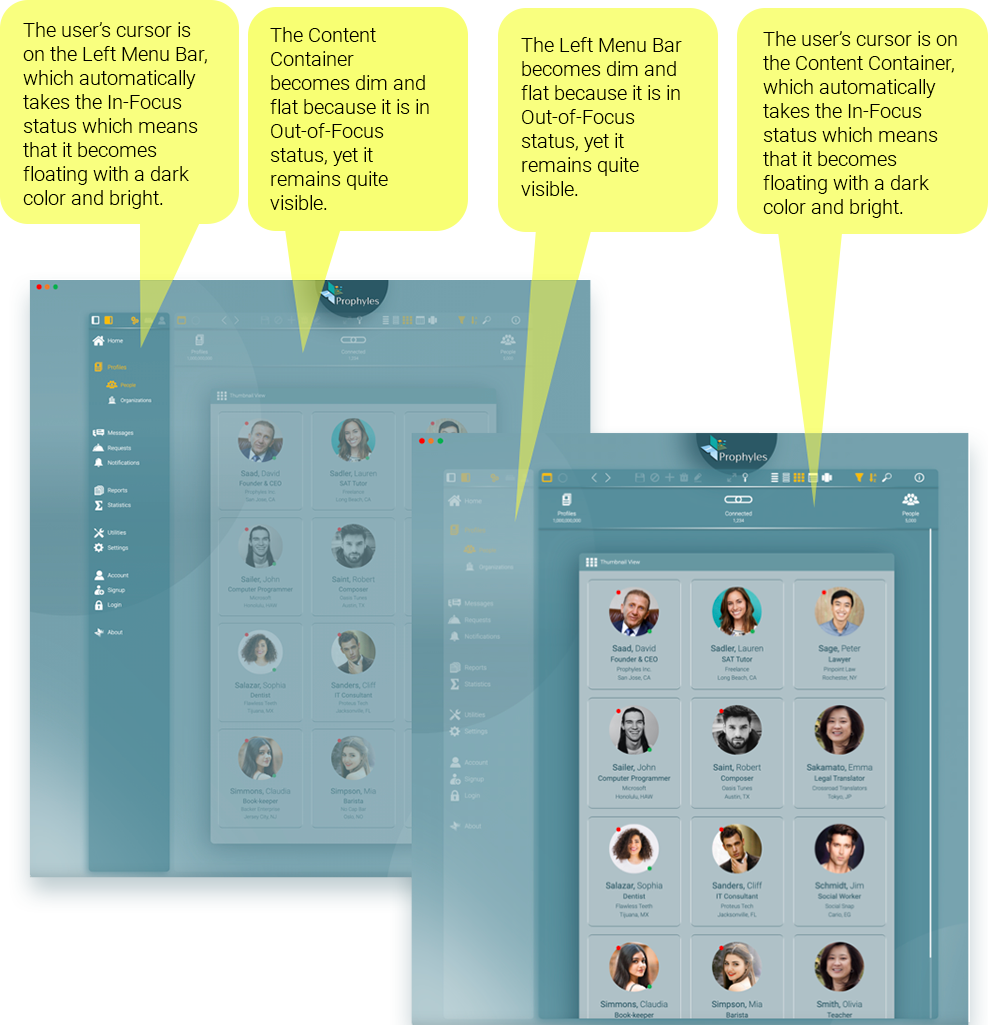
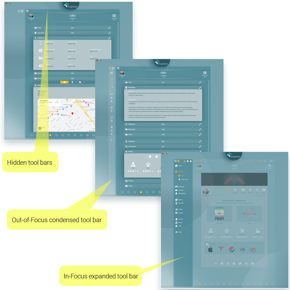
Prophyles uses the combination of glassmorphism with the new neumorphism offers the ideal style with the greatest usability and accessibility. It introduces the concept of In-Focus and Out-of-Focus effects but with subtlety in order to avoid the pitfalls of the regular neumorphism.
Personalization & Intelligence
The next generation UX/UI must offer a high degree of personalization through explicit settings and through implicit heuristic algorithms and machine learning that allow the UI to adapt to users’ usage, skills, habits, and preferences. The screenshots from Prophyles below show how tool menu bars can be expanded or condensed and displayed or hidden depending on user’s settings and/or user’s past navigation.
Benefits
Glassmorphism – the next next-thing
-
Increase usability
-
Increase accessibility by impaired users
-
Enhance user’s focus
-
Decrease clutter and distraction
-
Increase users’ satisfaction
-
Increase users’ loyalty
-
Enhance creativity
-
Promote uniqueness and branding
-
Increase adoption
-
Increase diffusion